Gill Sans, a sans-serif typeface widely used today, was designed by Eric Gill in 1926; the first public usage of the typeface was that same year, when Gill used it on signage for a new bookshop opening in his hometown of Bristol.
Gill Sans gained popularity in 1929 when it was chosen by Cecil Dandridge to be used on all posters and publicity materials of the London and North Eastern Railway systems. The iconic and highly legible lettering can still be seen on everything from locomotive nameplates and station signage to restaurant car menus and printed timetables.
In 1935, Penguin Books began to use the typeface for all of its jacket designs and in recent years, Gill Sans has been adopted formally for a wide variety of purposes — from the Church of England’s publications to Saab Automobile’s sleek usage in all of its marketing materials. The BBC officially adopted the typeface in 1997, and the British Government itself followed suit in 2003.
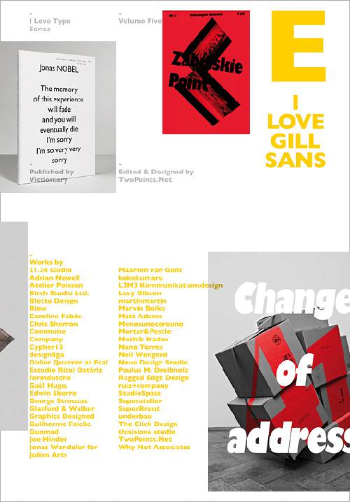
I Love Type 05 – Gill Sans explores the multitude of unexpected ways this popular typeface has been used, subverted, and reinvented by a host of clever and inspired designers in recent years.


